All builds Book a call
Construction · Japan · Kamata Koumuten · Rebuilt May 2026 (live); full redesign built October 2026, with the owner for sign-off

A Japanese construction company's website, redesigned so every word is readable and their real work leads.

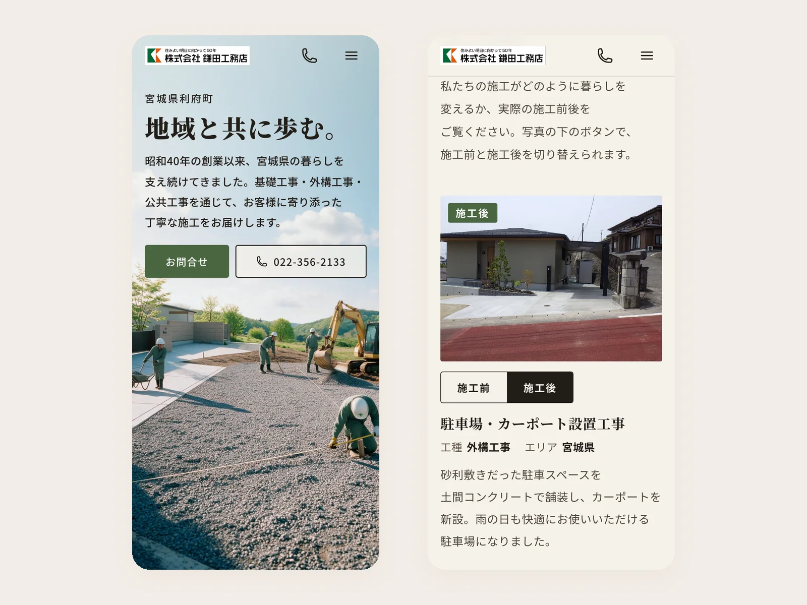
Tiny text, a broken phone layout and a contact form that never delivered. The rebuild made it readable and brought in a referral; the full redesign, now with the owner for sign-off, leads with their real jobs.

1industry board now referring the work: a regional construction association board member is recommending the site to the whole board One board member's active recommendation, off the rebuilt site. No board contract signed.
16px the smallest text anywhere on the redesign, checked automatically at 4 screen widths; on the old site up to 88% of the text was under 14px
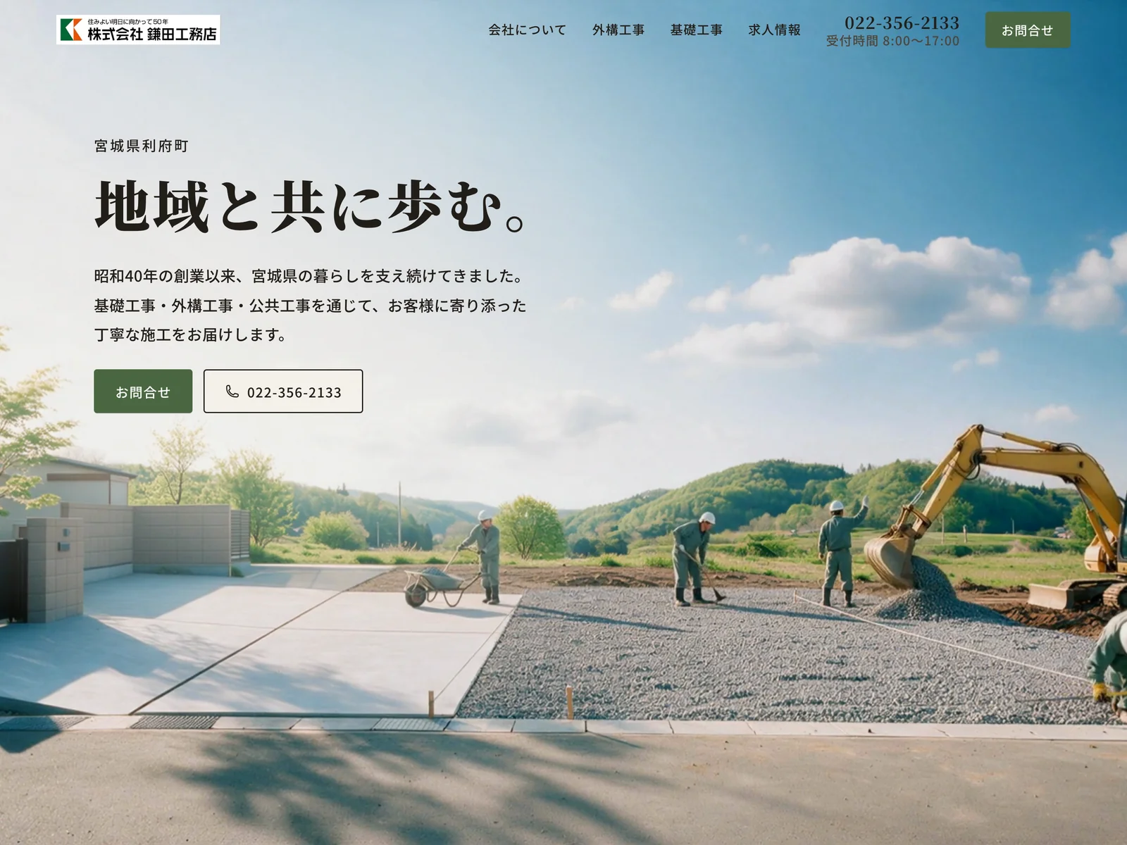
Kamata Koumuten homepage: the headline 地域と共に歩む。 over a sunny work site beside a finished house and gate
The redesigned homepage, with a slowly moving hero.
What was broken

Before

On the old site, 66% to 88% of the text was under 14px depending on the page, and up to 59% failed basic contrast. The phone homepage ran about 28 screens long, the work was shown as icon cards for a business whose work is visual, and the contact form had never delivered a single inquiry.

What I built

The build

What changed

Before and after

Before

By hand
The smallest textUp to 88% under 14px
Reading it on a phoneAbout 28 screens of homepage
Showing the workIcon cards
GoogleNo Search Console
ReferralsNone from the site

After

The system
The smallest textNothing under 16px
Reading it on a phoneBuilt for the phone, large type
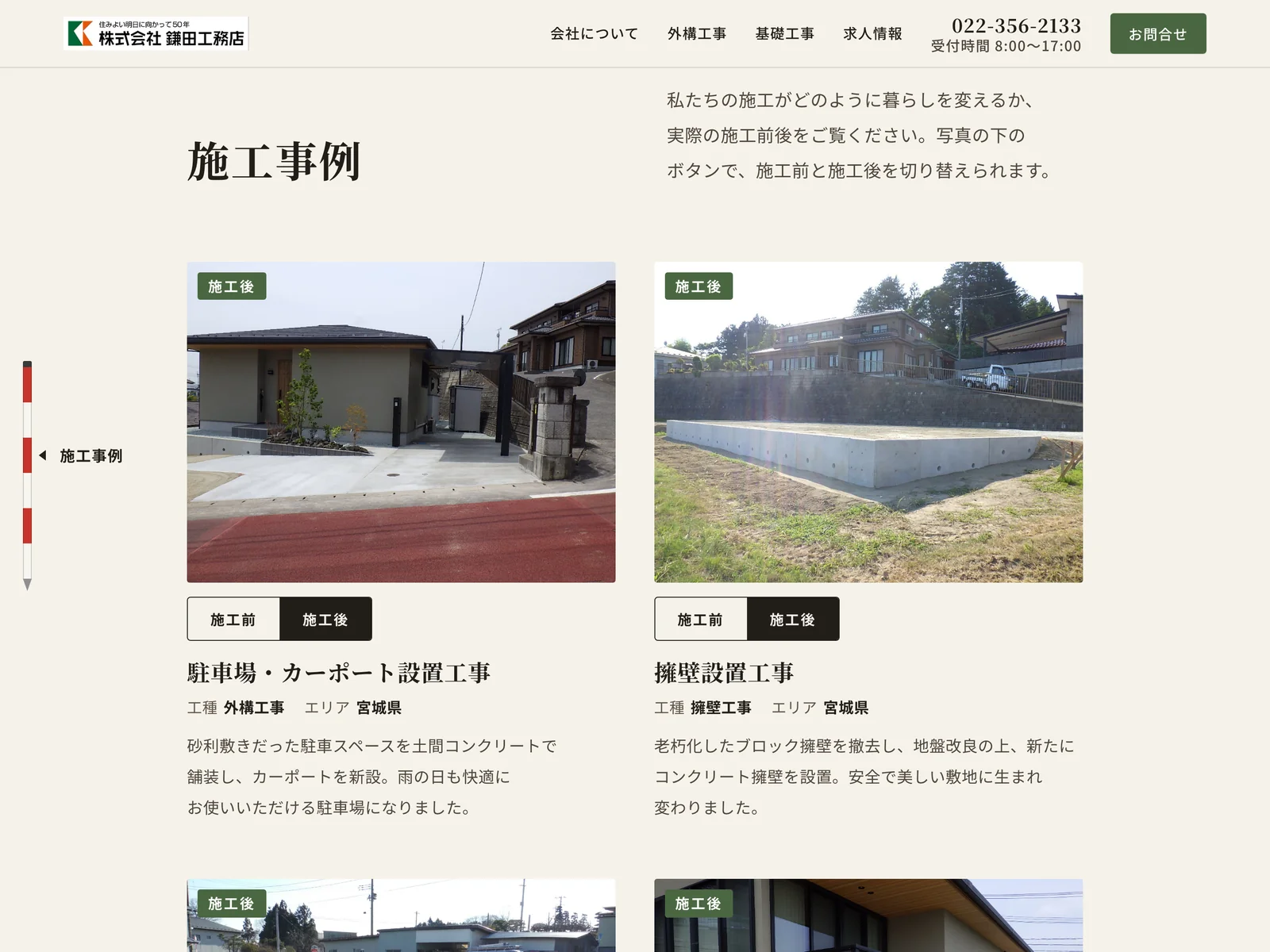
Showing the workReal jobs with before and after
GoogleSearch Console set up
ReferralsAn industry board member recommending it
Where the numbers come from. The old site's figures come from our audit of its pages. The referral is one board member's active recommendation; no board contract has been signed.
For engineers

How it's built

Architecture
A static homepage with a looping hero video, a survey-pole rail that marks the current section on wide screens, and before and after switches on the project photos. It deploys to the client's existing shared PHP host by mirror, with a backup taken first.
Where it runs
The client's own hosting, with previews on Vercel. Nothing of ours in the loop.
Tests and evals
A type check fails if any visible text drops under 16px at 1440, 1024, 390 or 360 wide. Every deploy verifies each page returns 200 and the search-console verification file is intact.
Cost and latency
The client's existing hosting. No new subscriptions.
Guardrails
Never delete the search-console verification file. Backup before every mirror. The deploy script changes into the directory first, because the mirror tool silently no-ops on paths with spaces.
The tradeoff we chose
Why this way and not the other

Kept their host and a static site instead of moving them to a builder. The owner's team is not technical, so the cheapest thing to maintain is a folder of HTML they own, plus a small CMS later for the one job they actually do themselves: posting a finished project.

Keep going